IRCTC REDESIGN
Simplifying the Railway Booking Experience
BRIEF
A UI/UX redesign of the IRCTC website focused on making
train search, booking and seat selection simpler, clearer
and easier to navigate.
Problem
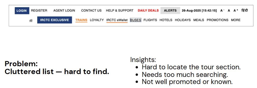
The existing IRCTC interface is information-heavy and visually
cluttered, making navigation and booking difficult for users.
Inconsistent layouts and weak visual hierarchy increase
cognitive load during the booking process.
Problem:
Hard to navigate, increases cognitive load.
Dense look, no breathing space, overwhelming
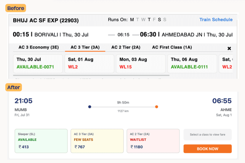
Problem:
Hard to compare prices of different classes
Problem:
Text-heavy filters, slower
navigation.
Unclear if boxes are selected
or not.
Research
We studied the existing IRCTC website to understand:
How users search for trains
How they compare available options
Where users face confusion
How seat and passenger information is presented
Where the booking flow becomes unnecessarily complicated
We also looked at common patterns used in modern
travel-booking platforms.
Competative ANALYSIS
We compared IRCTC with other train-booking platforms to identify
usability gaps in navigation, search, filtering, and information
hierarchy.
Key Insight: Simplify the experience without compromising
functionality.
Journey Map
Train ticket booking journey
Tour package booking journey
As Is Journey
Train ticket booking journey
Tour package booking journey
How Might We
How might we redesign IRCTC to provide customers
with a smooth, enjoyable experience and build brand loyalty?
Ideation
We used Crazy 8s to quickly explore multiple solutions for
simplifying the booking experience.
Ideas explored included:
Simplified homepage
Better search module
Cleaner train cards
Improved filters
Clearer seat availability
Simplified passenger details
Better booking progress indicator
More prominent primary actions
TO BE JOURNEY
Train booking journey
Tour package booking journey
Information Architecture
Mapped the IRCTC website’s content and features into clear
sections to understand the overall structure and make
navigation more intuitive.
DESIGN SYSTEM
A consistent visual language for the redesigned IRCTC
experience, covering colours, typography, icons, buttons,
inputs, cards, and
other UI components.
BEFORE AND AFTER
FINAL UI
The redesigned IRCTC interface simplifies the train booking
journey with a cleaner layout, clearer information hierarchy,
intuitive navigation, and improved visual consistency.
The redesign focuses on making searching, booking,
exploring destinations, and managing journeys more
seamless and user-friendly.